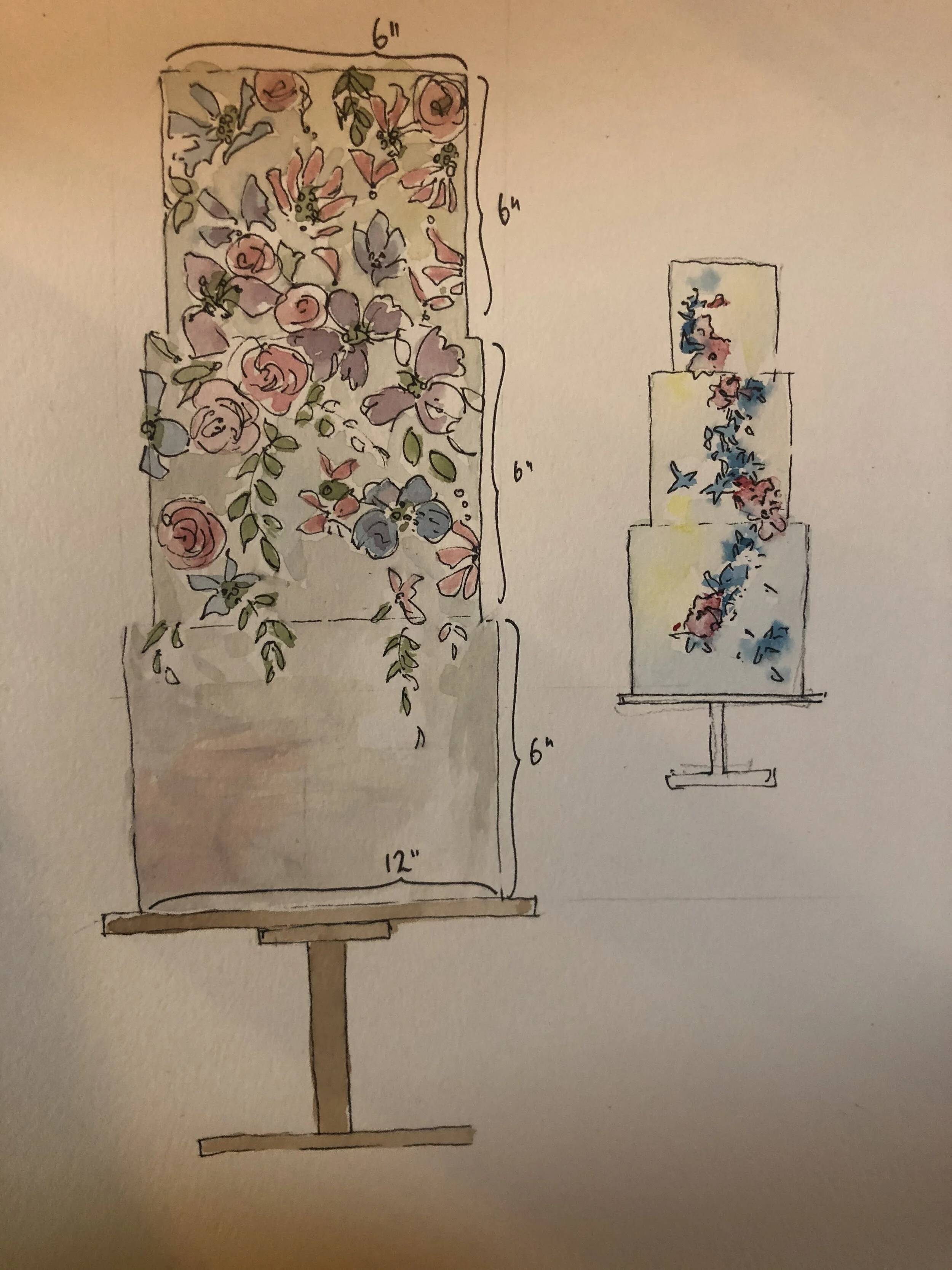
Sketching wedding cakes
It’s that time of year. Even though couples don’t know if they’re going to be able to get married any time soon, they’re putting together a wedding plan: it’s something to look forward to and get excited about during these dark and quiet evenings. Online consultations provide a brilliant opportunity to build a rapport with couples and the most effective way to follow up on your meeting is with a sketch or two of your ideas.
Even if you don’t fancy yourself as a brilliant artist (who does? If you were you’d be an artist right?) don’t ever skip this step in the sales process. It’s SO important. Look at this sketch, which a bride to be sent me years ago. On the back of a Frankie and Benny’s paper napkin she’d scribbled how she imaged her dream cake to look; ‘Don’t laugh PLEASE!’ she begged.
And here’s the cake. Not the sort of thing I’d make now, but see how her sketch informed the design so accurately?
The thing is, even the quickest, most amateur little sketch will convey more visual information than you ever could in words. Even my most awful sketches, some I’ve even done in a doctor’s waiting room or at parents’ evening, have been successful in as much as they’ve formed the basis of a wedding cake design and clinched a sale.
I’ve tried all sorts of ways to sketch cakes and have discovered that watercolour and pen suit my style of cake fairly well. I find coloured pencils too limiting in terms of shade and colour. I tend to sketch the outline in pencil (nearly always leans to one side so a set square is helpful for getting it straight), draw the detail in pen and then fill with very dilute water colour and a fine brush.
I use a set of simple shapes to illustrate different flowers: spirally circles for roses, scribbly circles for peonies and zigzaggy circles for dahlias. Hydrangeas are big circles of tiny circles and flower spikes are just long wobbly triangles.
You can give your blooms depth by applying colour to the centre and allowing it to fade to the outside. Cascades of foliage and flower spikes add vertical movement so make use of them if your floral decoration will be concentrated around the ledges between tiers.
A neutral wash around the edges of your sketched cake will make it look more solid.
Add notes to describe what you’ve drawn. Write clearly and use arrows to highlight specific elements. Include dimensions, and possibly servings and flavours if these have been decided. I sometimes include a couple of simpler, smaller sketches to show basic alternatives to the side of the main drawing. Always include the names of the couple, their date and venue.
In my experience, a successful sketch provides a resource for your couple to pour over: lots of information presented in an engaging way, and that shows that you’re prepared to make a thoughtful effort for them even at an early stage. If they like it you can send it to them after the wedding as a memento.
Don’t forget to check out my Pinterest board for more cake sketch ideas!!!


